
Talent Individuals
Look like the calibre of people you represent.
The brief
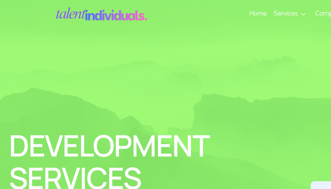
A talent agency wanted a site that clears a high visual bar the moment it loads, one that looks as capable and modern as the engineers and designers it places for clients.
How we built it
- 1
A confident, technical identity
Oversized display type and a violet-to-pink brand mark set the tone immediately, so the first screen reads as the work of serious people.
- 2
A service per page
Development, design, data, and marketing each get their own focused page, each with its own mood: a green-mist development hero, a dark gridded services section, one connected system.
- 3
Built to grow one page at a time
The site is assembled page by page so the agency can extend it as it adds services, without a rebuild.
Why we built it this way
The first screen has to earn trust
An agency selling technical talent is judged on how its own site looks. The scale of the type and the colour do that work before anyone reads a word.
Focus beats one long scroll
Splitting each service onto its own page keeps every pitch sharp and specific, instead of burying it in an endless single page.
What it does
- Bold, oversized display typography
- Violet-to-pink brand identity
- A dedicated page per service
- Distinct but connected moods across the site
Built with
- HTML
- CSS
- JavaScript
- Custom type system
Ready for a real online store?
We’re onboarding our first owners now. Fixed price from ₦150,000, live in one to two weeks.
A short call, no commitment. hello@shelfhand.com